jesse hebert is an interdisciplinary designer
based in canada, connecting with clients worldwide
based in canada, connecting with clients worldwide
graphic design
art direction
branding
visual identity
logo design
motion design
Web Design
web Development
photography
art direction
branding
visual identity
logo design
motion design
Web Design
web Development
photography

Shayenna Nolan


Shayenna Nolan
A flexible design system for multidisciplinary artist, photographer, and freshwater scientist, Shayenna Nolan. Inspired by Shayenna’s Indigenous heritage, the identity was built as a modular system—open-ended, expansive, and able to hold the tension between art and science without collapsing either into a mold. The toolkit includes ten logotypes and marks, 98 colour swatches across nine Earth-based palettes, a type system spanning over 200 styles, and more than 100 detail elements used to build graphs, image containers, interfaces, and more. Eight Are.na boards contextualize the brand's spirit and offer research, references, and paths of inquiry. The result is a future-proof brand that adapts as fluidly as Shayenna’s own practice.

GVO Run


gvo Run
A dynamic visual identity for a Fort Lauderdale-based run club and extension of GVO Cycle. Designed around a logotype that mirrors the lean of a runner mid-stride, the system plays with angled forms, bold repetition, and motion-driven structure. The logo exists in ten skewed variations—used not just as marks, but as interlocking shapes, containers, and patterns. A shared colour palette with GVO Cycle ties the two communities together, while the dynamic shape system keeps GVO Run moving on its own terms.

GVO Cycle


gvo cycle
A fitness and wellness studio rooted in community. GVO Cycle’s identity is intentionally layered—mixing bold typography and vivid colour with a tactile, analog touch. From custom binders and desktop collages to mixed media animations to a custom print-scan workflow that introduces natural imperfections, the brand celebrates the presence of process. Every output, whether digital or physical, carries a sense of energy, rawness, and lived-in texture.

Thunder & Lightning


Thunder & Lightning
Thunder & Lightning is an upcoming documentary exploring the journey of Georgia Bulldogs alumni and NFL running backs Sony Michel and Nick Chubb. I approached the design with a motion-first mentality, beginning with kinetic typography and building the rest from there. The goal was to create movement that mirrors the unpredictable nature of a running back’s plays. Custom easing curves were developed to bring dynamism to even the simplest animations, giving them that “juking” feel. The result is a high-impact design system that moves with the same intensity and unpredictability as the athletes themselves.

West Park Saints


West Park Saints
West Park Saints is a community-driven project by Sony Michel, offering a free one-day football camp for inner-city youth in West Park, FL. The camp is designed to help kids connect, grow, and develop leadership skills. I was brought on to design the camp’s visual identity, including the logo suite, uniforms, t-shirts, social media assets, and promotional materials. The identity blends elements of the New Orleans Saints with heritage typography and vibrant Miami colours, giving it a sense of local pride and energy. The visual system leans into collage and bold type to create a youthful spirit.

Lucas Köksal


Lucas Köksal
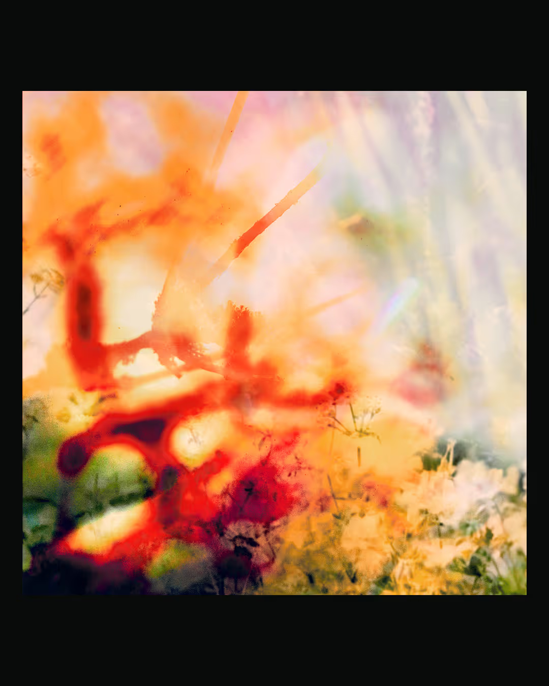
Lucas Köksal is an independent producer and singer/songwriter blending indie pop, funk, R&B, and electronic sounds. Lucas onboards me early on in the process, when the music is still taking shape. From there, we embark on a long, experimental journey, driven by instinct and the tension between what feels organic and what feels synthetic. As the music evolves, so does the visual direction, constantly shifting together. There’s a fluidity in the process, a back-and-forth of pushing forward, pulling back, and recalibrating until we find that sweet spot where the visuals and the music feel most alive.

NONSENSE


Nonsense
A bold identity for boundary-pushing artist and designer Eric Faraci. At a creative crossroads, Eric was looking to break free from the patterns his early success had carved out. Our collaboration was about more than just design; it was a journey to rediscover his voice. Through targeted workshops, assignments, and deep discovery meetings, we redefined his path. With his vision clear, we set to work on an identity that would communicate this new chapter. The result is a rebellious, maximalist visual system of unconventional logos, wild typography, and vibrant colour palettes. This project culminated in a portfolio site as dynamic and unruly as the work it showcases.

FAZE


FAZE
A passion project that channels the punk ethos through bold, independently made printed works. This project allows me to take a research-driven approach to design. For the better part of this project, I have been diving deep into the history of resistance movements and exploring their relevance today. Each collaboration with other artists and creators shapes the narrative, pulling together elements of rebellion, independence, and bold expression. Through FAZE, I’ve been able to craft a space for inquiry, experimentation, and raw expression.